

Understanding Hammer Candlestick Patterns
📊 Learn to spot hammer candlestick patterns to spot potential trend shifts in trading. Understand variations & use them with other tools for smarter trades.
Edited By
Thomas Grey
Candlestick charts have become a staple tool for many traders and investors across the world, including here in South Africa. They provide a visual way to track price movements and help interpret market sentiment quickly. Unlike plain line charts, candlestick charts show the open, close, high, and low prices within a given time frame, giving a more complete picture of trading action.
Each candlestick consists of a rectangular body and thin lines called wicks or shadows extending above or below. The body’s colour indicates whether the price closed higher or lower than it opened—commonly green for an increase and red for a decrease. This simple visual cue allows traders to scan charts and grasp trends or reversals at a glance.
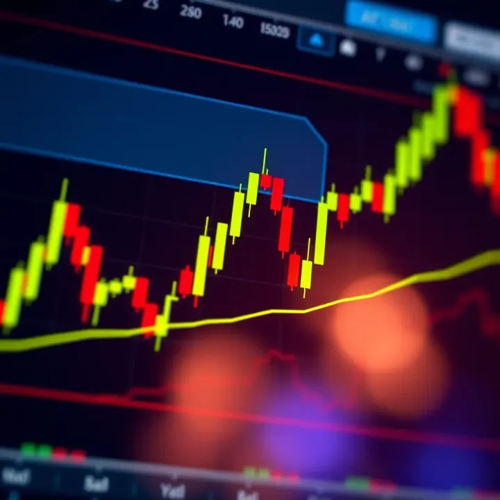
Understanding what different candlestick shapes and patterns signal can greatly improve your market analysis and trading decisions.
Candlestick patterns are groups of one or more candlesticks that form specific shapes known to suggest certain price behaviours. For example, a "hammer" pattern with a small body and long lower wick can indicate a potential bullish reversal after a downtrend, while a "shooting star" with a long upper wick might hint at bearish pressure.
Some popular patterns include:
Doji: When open and close prices are nearly the same, signalling indecision.
Engulfing patterns: Where one candlestick completely covers the previous one, often showing stronger momentum.
Morning star and evening star: Three-candle patterns indicating trend reversals.
Applying these patterns requires practice and context. They’re most reliable when combined with other technical tools like volume, moving averages, or support and resistance levels. For instance, spotting a bullish engulfing pattern near a known support zone might increase your confidence in entering a trade.
In South African markets, considering external factors like economic data releases, JSE volatility, or Eskom-related news alongside candlestick signals helps paint a fuller picture. Remember, no pattern promises certainty—trading always carries risk.
In the following sections, we will break down key candlestick patterns, their meanings, and how to interpret them effectively to make smarter decisions in your trading journey.
Candlestick charts offer an invaluable way to understand market movements by showing the price action within specific periods. For traders and analysts, these charts go beyond simple numbers and reveal patterns that hint at potential future directions. When you’re looking at a candlestick chart, you’re essentially peeking into how buyers and sellers behaved during a set time frame, which can give you clues about momentum and sentiment.
These charts are especially useful because they pack a lot of information into a clear and concise format. For instance, instead of just seeing a closing price like on a typical line chart, a candlestick chart shows the open, close, high, and low prices, making it easier to spot turning points or strong trends. This helps you make more informed decisions, whether you’re trading shares on the JSE or following commodity prices like gold or platinum.
Candlestick charts represent how an asset's price moves over a set period—whether that’s minutes, hours, days, or weeks. Price action refers to the story told by these price changes without needing extra indicators. By watching how the candles form and evolve, traders can gauge whether buyers or sellers have control, which often helps predict short-term shifts in market direction.
For example, if a series of green (bullish) candlesticks forms, each closing higher than the last, this can indicate growing buying pressure. Conversely, a string of red (bearish) candles might suggest sellers gaining the upper hand. Understanding this "price flow" is critical, especially during volatile periods when the Rand fluctuates amid economic announcements.
Each candlestick consists of four key data points: the opening price, closing price, highest price, and lowest price during the chosen time frame. The rectangular body shows the range between the open and close, while thin lines called wicks or shadows represent the highs and lows.
The relationship between open and close tells you if the price rose or fell. For instance, in a daily chart of Capitec Bank shares, a candle where the close is above the open is typically coloured green or white, signalling bullish sentiment. Meanwhile, a close below the open is usually red or black, indicating bearish pressure. These distinctions help traders quickly assess market mood and spot potential entry or exit points.
Line charts are the simplest form, connecting closing prices over time with a continuous line. While easy to read, they omit valuable data such as the high, low, and opening prices. Bar charts add some of this detail by displaying vertical lines with marks for open and close, but they tend to be less visually intuitive.
Compared to these, candlestick charts provide a fuller picture with colour coding and shape, making patterns and trends more visible. For instance, spotting a hammer or shooting star pattern on a candlestick chart is much quicker than trying to decode the same info on a bar chart.
One of the greatest benefits of candlestick charts is how they expose the tussle between buyers and sellers right on the screen. The size and colour of the candle bodies, along with the length of the wicks, reveal whether bulls or bears controlled the session, indicating sentiment swings.

This visual insight lets traders respond swiftly to market changes, and not just react to price levels. For example, when a long lower wick forms, it often signals buying support at lower prices, even if the close is bearish. This subtlety can make the difference when managing risk or timing trades in markets affected by factors like Eskom load-shedding or geopolitical tensions.
Understanding candlestick basics equips traders with a richer grasp of price movements—moving beyond mere numbers to see the story behind the market action.
Understanding the basic components of a candlestick and recognising common formations are fundamental skills for any trader aiming to read the market more effectively. Each candlestick tells a story of price movement within a given time frame, and patterns formed by multiple candlesticks can reveal potential turning points or continuations in the market.
A candlestick consists of three main parts: the body, the wick (also known as the shadow), and the colour. The body represents the price range between the opening and closing of that period. If the closing price is higher than the opening, the body typically shows in a lighter colour such as white or green, reflecting bullish sentiment. Conversely, a dark or red body indicates the closing price was lower than the opening, signalling bearish pressure. The wicks, thin lines extending above and below the body, mark the highest and lowest prices during that period, showing volatility beyond the opening and closing levels.
Colour plays an important role for quick visual interpretation. In South African markets, platforms often use green and red by default, but traders should adjust according to personal preference as long as bullish and bearish movements are clearly distinguishable. For example, a candlestick with a small body but long upper wick suggests buyers pushed prices up, but sellers regained control before close, a sign of potential resistance.
Bullish and bearish candlesticks carry practical relevance beyond their colours. A bullish candlestick shows increasing demand, signalling buyers have the upper hand. It becomes crucial to watch for these after a downtrend, as they may hint at a reversal or a relief rally. On the other hand, a bearish candlestick indicates selling pressure, worth noting at potential highs or resistance areas where sellers might step in. For instance, spotting a series of bearish candles near a previous swing high could mean it’s time to tighten stop losses or consider exiting long positions.
Certain candlestick formations grab traders' attention for their predictive potential. The Doji, for example, features a very small body where open and close prices are virtually the same. It signals indecision in the market and often appears before a reversal. If you see a Doji after a strong uptrend, it might be wise to exercise caution as momentum could stall.
The Hammer is a bullish reversal pattern characterised by a small body near the top and a long lower wick, reflecting rejection of lower prices during the session. Conversely, the Shooting Star looks similar but appears after an uptrend, with a small body near the bottom and a long upper wick signalling sellers pushed prices down before close.
Traders also watch for the Spinning Top, with a small body and longer wicks on both ends, indicating uncertainty and low momentum. This can suggest a market pause before a decisive move. Meanwhile, an Engulfing Pattern, especially a bullish engulfing, occurs when a large candle completely covers the previous smaller candle in the opposite direction, implying strong momentum shift. For example, in a downtrend, a bullish engulfing might be a solid sign that buying pressure is rising and a reversal is possible.
Learning to read these basic components and formations underpins more advanced analysis, offering you practical insights that help to spot entry and exit points with confidence, rather than guesswork.
Together, these fundamentals form the bedrock of candlestick pattern analysis, crucial for smarter trading in South African and global markets alike.
Understanding key candlestick patterns is essential for traders to anticipate potential market moves. These patterns provide clues about shifts in buying and selling pressure, signalling either a possible reversal or continuation of the current trend. By recognising these formations, you can improve timing for entries and exits, making your trading decisions sharper and more informed.
Morning star and evening star are classic reversal indicators that often appear at significant turning points. The morning star suggests a bullish reversal typically after a downtrend. It starts with a long bearish candle, followed by a small-bodied candle (showing indecision) and then a strong bullish candle closing above the midpoint of the first candle. This pattern hints that sellers are losing steam and buyers are taking control, useful for spotting potential buy opportunities.
Conversely, the evening star signals a bearish reversal after an uptrend. It mirrors the morning star but in reverse: a strong bullish candle, a small indecisive candle, then a bearish candle closing well into the body of the first candle. Traders can interpret this as a warning that momentum is shifting and a downtrend might be starting, prompting them to tighten stops or consider short positions.
Three white soldiers and three black crows are powerful continuation or reversal patterns comprising three consecutive candles. Three white soldiers feature three long bullish candles with consecutive higher closes, indicating sustained buying pressure. This pattern often marks the end of a downtrend or confirms a strong uptrend, signalling confidence to hold or buy.
On the flip side, three black crows consist of three long bearish candles, each closing lower than the previous. This pattern suggests heavy selling pressure and often predicts further downward momentum. It’s a practical signal for traders to consider exiting longs or entering short positions.
The rising and falling three methods patterns indicate trend continuation with some pauses. The rising three method shows a strong bullish candle followed by several small-bodied candles staying within the range of the first candle, then a final bullish candle breaking higher. This signals the bulls are taking a breather but remain firmly in control, useful when deciding to hold or add to long positions.
In contrast, the falling three method features a strong bearish candle, a few small-bodied candles within its range, then another bearish candle pushing the price down further. This pattern confirms sellers are still dominant, helping traders confirm ongoing downtrends.
Bullish and bearish flags are short-term continuation patterns resembling small pullbacks in a trend. A bullish flag forms after a sharp upward move, with price consolidating in a tight channel slanting slightly downward before breaking out higher. It’s a sign the uptrend will carry on and can guide traders to enter or add to long trades.
Meanwhile, a bearish flag appears after a steep drop, with price drifting sideways or slightly up inside a narrow channel prior to another downward move. This pattern warns of further declines and can alert traders to prepare for continuation of the downtrend or to exit long positions.
Mastering these candlestick patterns helps traders read market psychology at a glance, improving timing and risk management. However, always combine patterns with other indicators and context for safer trades.
Candlestick patterns offer valuable clues about market sentiment, but their real power lies in how traders incorporate them into broader strategies. They do not provide standalone answers; rather, they serve as part of a larger toolkit that includes volume analysis, trend indicators, and risk management. Understanding how to combine candlestick signals with other data can reduce false signals and improve decision-making in volatile markets like those in South Africa.
Volume acts as a confirmation tool for candlestick patterns. For example, a bullish engulfing pattern is more compelling when accompanied by higher-than-average trading volume, signalling that buyers have genuinely taken control. Without adequate volume, the pattern might be a false positive, reflecting mere price fluctuations rather than a real shift in sentiment. Traders benefit from checking volume spikes to verify if a reversal or continuation pattern has true backing.
Trend indicators such as moving averages or the Relative Strength Index (RSI) provide context for candlestick patterns. Suppose the pattern appears alongside a rising 50-day moving average; the likelihood of a sustained uptrend increases. Conversely, candlestick signals at key trend turning points deserve closer attention. This combined approach helps avoid mistaking short-lived price wobbles for meaningful changes.
Support and resistance levels further ground candlestick analysis. When a bullish hammer forms near a well-established support line, it often marks a price floor with stronger buying interest. Similarly, bearish reversal patterns near resistance could hint at upcoming price drops. These levels act as psychological barriers, making candlestick signals more reliable when aligned with them. Ignoring them risks misreading isolated patterns that lack broader market context.
Candlestick patterns are more effective when seen alongside volume, trend signals, and key price levels—this layered approach helps separate noise from genuine opportunities.
Good trading is not just about spotting signals but managing risk effectively. Stop losses and take profits can be set based on candlestick patterns to protect capital and lock in gains. For instance, placing a stop loss just below the low of a bullish engulfing candle gives a clear exit point if the pattern fails. Take profit targets might align with recent highs or resistance zones, ensuring traders have a plan—not just hope.
Over-reliance on single candlestick signals is a common pitfall for new traders. Markets are complex, and one pattern does not guarantee outcomes. Multiple confirming signals reduce the risk of acting on false positives or market noise. For example, traders might wait for a candlestick pattern to coincide with an oversold RSI and a bounce off support before entering a trade. This cautious, layered approach avoids rash decisions driven by isolated price action.
In South Africa, where market volatility can be high due to factors like Rand fluctuations or economic updates, risk management anchored in candlestick analysis becomes even more critical. Discipline in exit strategies and signal confirmation helps traders navigate unpredictable swings and protects their investment.
Candlestick chart patterns offer valuable clues about market movements, but they’re not foolproof, especially when applied in real-world trading. This section sheds light on common pitfalls and offers practical advice tailored for South African traders. Understanding limitations helps to avoid overconfidence, while practical tips can improve the accuracy of trading decisions in a market affected by unique local factors like Rand volatility, economic news, and regulatory changes.
Market volatility and external factors present a major challenge when using candlestick patterns in trading. South African markets can be particularly unpredictable due to factors like Eskom’s loadshedding schedules, fluctuating commodity prices, or political events. These can cause sudden swings in prices that distort typical candlestick signals. For example, a bullish engulfing pattern may appear one moment but get quickly negated by an unexpected policy announcement or a sharp Rand depreciation.
Because of this, it’s risky to rely solely on candlestick patterns without considering the wider context. Market sentiment shifts abruptly in SA, especially during election cycles or when global financial conditions change. Traders who ignore these external influences can end up chasing false signals or getting caught in sudden reversals that the patterns alone can’t predict.
Common mistakes and misconceptions often trip up folks new to candlestick analysis. One typical error is over-interpreting a single candlestick or pattern as a guaranteed trade signal. Many traders jump in when spotting a hammer or shooting star without confirming trends, volume, or other technical indicators. This can lead to premature entries or missed exits.
Another misconception is treating all candlestick patterns the same across different time frames. A doji on a 15-minute chart doesn’t carry the same weight as on a daily chart. Mixing these without proper context often leads to confusion and poor timing. Recognising that candlestick analysis is just one tool among many, rather than a crystal ball, can help South African traders manage expectations and improve discipline.
Adjusting for Rand volatility is crucial for traders active in the JSE or forex markets. The South African rand can be highly volatile, especially against major currencies like the US dollar or euro. This volatility significantly affects price charts and pattern formations. For instance, a sudden rand sell-off due to external pressure might create odd candlestick shapes that don’t reflect normal trader behaviour but rather currency risk.
To cope, traders should combine candlestick patterns with awareness of rand movements and possibly hedge their exposure. Using broader macroeconomic indicators and currency risk sentiment can prevent false readings. Keeping an eye on rand-related news and adjusting stop losses accordingly adds a safety net that’s especially important in a market sensitive to currency swings.
Incorporating news and economic data relevant to SA forms part of savvy candlestick trading. Localised events, such as SARB interest rate decisions, unemployment figures, or major strikes in key sectors, often drive price shifts that candlestick charts won’t predict on their own. For example, mining strike announcements can trigger volatile moves in resource stocks that challenge textbook candlestick patterns.
Successful traders marry chart patterns with a real-time understanding of the economic and political backdrop. That means keeping up with daily news from sources like BusinessTech, Moneyweb, or the Financial Sector Conduct Authority updates. Integrating this info helps validate or question the signals that candlestick formations give, leading to more grounded and timely trades.
Always remember: candlestick patterns are a part of your toolkit, not the whole story. Adapt your approach to South Africa’s unique market conditions to make smarter decisions.
By recognising these challenges and tailoring candlestick analysis to local realities, South African traders can improve the practical value of this popular technical tool while reducing the chances of costly mistakes.
📊 Learn to spot hammer candlestick patterns to spot potential trend shifts in trading. Understand variations & use them with other tools for smarter trades.
Learn about halal forex trading 📈, key Shariah compliance principles, practical strategies, and how Muslim traders in South Africa navigate ethical forex markets.
🌍 Discover how global forex trading works, exploring market structure, currency factors, strategies, risk control & tech tools for smarter currency trades.

Learn how margin works in forex trading, why it's vital, the risks involved, and smart tips to manage margin responsibly for safer trades 📊💡
Based on 11 reviews